

At Kelly Tareski Photography, we know that choosing the right background colors can make or break a portrait. The perfect backdrop enhances your subject’s natural beauty and creates a stunning visual impact.
In this guide, we’ll share our photography education insights on selecting background colors that complement various skin tones. You’ll learn practical tips to elevate your portraits and create images that truly shine.
Understanding Skin Tones and Color Theory in Photography
The Spectrum of Skin Tones
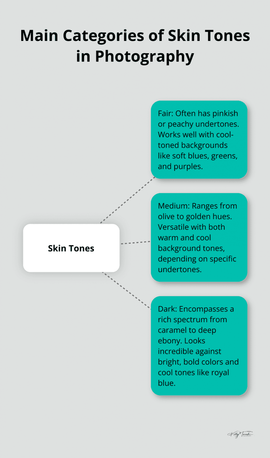
Skin tones vary widely, from very fair to deep dark. Most people fall somewhere in between these extremes. In photography, we typically categorize skin tones into three main groups: fair, medium, and dark. Within each category, a wide range of variations exists.
Fair skin tones often have a pinkish or peachy undertone. Medium skin tones can range from olive to golden hues. Dark skin tones encompass a rich spectrum from caramel to deep ebony. Skin tones reacts differently to light and color, which makes understanding them essential for selecting the right background.
Decoding Warm vs. Cool Undertones
Beyond the surface color of the skin, undertones play a significant role in how colors interact with a person’s complexion. Undertones typically fall into three categories: warm, cool, or neutral.
Warm undertones have a golden, peachy, or yellow hue. Cool undertones appear more pink, red, or blue. Neutral undertones mix both warm and cool characteristics.
To determine undertones, examine the veins on the inside of the wrist. Greenish veins suggest warm Blue or purple veins indicate cool undertones. If it’s hard to tell, the undertone might be neutral.
Color Wheel Basics for Photographers
The color wheel serves as a powerful tool for photographers. It helps us understand how colors relate to each other and how we can use them to create harmony or contrast in an image.
Colors opposite each other on the wheel are complementary. They create strong contrast and can make a subject pop. For example, orange and blue are complementary colors. This explains why a warm-toned subject often looks striking against a cool blue background.
Adjacent colors on the wheel are analogous. They create a harmonious, soothing effect. This can prove useful when you want to create a calm, unified look in your portraits.
Understanding these color relationships allows photographers to make informed decisions about background colors that will enhance their subject’s natural skin tone. It’s not just about what looks good in isolation, but how the colors interact with each other and the subject to create a cohesive, impactful image.
Applying Color Theory to Portrait Photography
When we apply color theory to portrait photography, we open up a world of creative possibilities. By understanding the interplay between skin tones, undertones, and background colors, we can create portraits that truly showcase our subjects’ natural beauty.
For example, a subject with warm undertones might look stunning against a background with cool tones (like blue or purple). This creates a pleasing contrast that makes the subject stand out. On the other hand, a subject with cool undertones might shine in front of a warm-toned background (such as soft oranges or yellows).
However, these are not hard and fast rules. The beauty of photography lies in experimentation and finding what works best for each unique individual. In our next section, we’ll explore specific background color recommendations for various skin tones, providing you with a practical guide to elevate your portrait photography.
Which Background Colors Enhance Different Skin Tones?
Selecting the right background color for your subject’s skin tone can dramatically enhance the overall impact of your portrait. This guide will help you choose background colors that complement various skin tones.
Fair Skin Tones
Cool-toned backgrounds often work best for fair skin. Soft blues, greens, and purples create a beautiful contrast without overpowering the subject. Pastel shades add a touch of softness to the image.
Don’t shy away from bolder choices. Deep jewel tones (like emerald green or sapphire blue) can create stunning portraits with fair-skinned subjects. These rich colors provide a dramatic backdrop that makes fair skin glow.
Try to avoid overly warm or bright colors like orange or yellow, as these can cast unflattering tones onto fair skin. If you want a warmer backdrop, consider muted earth tones or soft pinks.
Medium Skin Tones
Medium skin tones offer the most versatility for background colors. Both warm and cool tones can work beautifully, depending on the specific undertones of the subject’s skin.
For warmer medium skin tones, rich, earthy colors like deep oranges, warm browns, and olive greens complement the natural warmth in the skin, creating a harmonious overall look.
Cooler medium skin tones shine against backgrounds in shades of blue (from sky blue to navy). Purple tones, particularly lavender and plum, also create stunning portraits with medium skin tones.
Dark Skin Tones
Dark skin tones look incredible against bright, bold colors. Vibrant reds, oranges, and yellows create eye-catching portraits that celebrate the richness of dark skin.
Cool tones can also work wonderfully. Light- to medium-toned royal-blue backdrops generally provide contrast to dark skin tones without casting abnormal hues onto the skin.
Try to avoid muddy browns or dull greys, as these can make the image feel flat. Instead, opt for colors with depth and vibrancy to truly showcase the beauty of dark skin.
Universal Colors
Some colors tend to work well across all skin tones. Navy blue, for instance, is a versatile choice that complements fair, medium, and dark skin beautifully.
Neutral tones (like soft greys and taupes) can also work across the board, providing a subtle backdrop that allows the subject to shine. These colors are particularly useful for professional headshots or when you want the focus to be entirely on the subject.
The key to selecting the perfect background color lies in understanding not just skin tone, but also undertones, hair color, and the overall mood you want to convey in your portrait. Don’t be afraid to experiment – sometimes the most unexpected color combinations can lead to truly breathtaking results.

Now that we’ve explored the best background colors for different skin tones, let’s move on to some practical tips for selecting and implementing these colors in your photoshoots.
How to Select the Perfect Background Colors
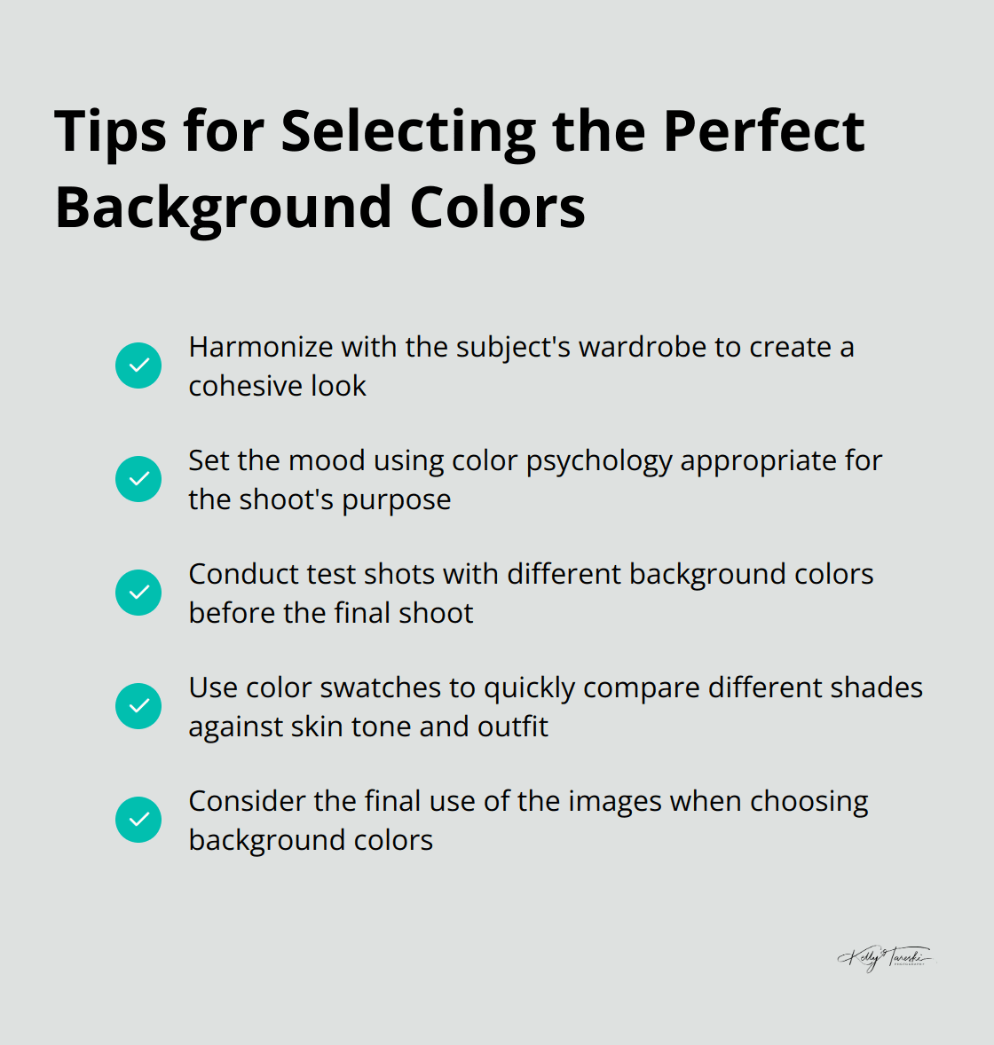
Harmonize with the Subject’s Wardrobe
The subject’s clothing influences the ideal background color. We ask our clients to bring various outfits to the shoot. This allows us to experiment with different color combinations and find the perfect match.
If a client wears a bold red dress, we might opt for a neutral grey or taupe background to avoid color clash. Alternatively, we could choose a complementary green backdrop for a more dramatic effect. The goal is to create a harmonious relationship between the outfit and the background.
Set the Mood with Color Psychology
The purpose and mood of the photoshoot should guide your color selection. For corporate headshots, we often stick to neutral tones like grey or navy blue, which convey professionalism and reliability. For more creative or personal shoots, we might use vibrant colors to evoke energy and personality.
Color psychology plays a significant role in photography. It’s a powerful way to form emotions and create a deeper narrative. We always discuss the desired mood with our clients before settling on a background color.
Test and Adjust
Never underestimate the power of testing. We always conduct test shots with different background colors before the final shoot. This practice has saved us from potential color mishaps.
We use a variety of backdrops and lighting setups to see how different colors interact with the subject’s skin tone and outfit. Sometimes, a color that looks great in theory doesn’t translate well on camera. These test shots allow us to make necessary adjustments and ensure the best possible outcome.
What works in one lighting situation might not work in another. Natural light, studio lighting, and even the time of day can affect how colors appear in your photos. Always test your color in the same lighting conditions you’ll use for the final shoot.
Use Color Swatches
Color swatches are invaluable tools for selecting the perfect background color. These small samples of color (often in the form of cards or fabric swatches) allow you to quickly compare different shades against your subject’s skin tone and outfit.
Try to keep a variety of color swatches in your photography kit. This will enable you to make quick decisions on-set and ensure you’re choosing the most flattering background color for each individual subject.
Consider the Final Use of the Images
The intended use of the photographs should influence your background color choice. For example, if the images are for a business website, you might want to incorporate the company’s brand colors into the background. For personal portraits that will be displayed in a home, consider the decor and color scheme of the space where the photos will hang.
Final Thoughts
Selecting the perfect background color to complement skin tones is an essential aspect of portrait photography. We understand the interplay between skin tones, undertones, and color theory to create stunning images that enhance our subjects’ natural beauty. Warm skin tones often pair well with cool backgrounds, while cool skin tones can shine against warmer backdrops (though these guidelines are just starting points).
Our personal style and artistic vision play a significant role in creating memorable portraits. We consider factors such as the subject’s clothing, the desired mood, and the intended use of the images when selecting background colors. Photography education is an ongoing journey, and we continue to explore color theory and its application in portrait photography.
Kelly Tareski Photography offers a wide range of personalized options for those seeking professional photography services in Spokane, Washington. We specialize in capturing timeless, elegant portraits that truly reflect our clients’ personalities. Our team creates high-quality images for senior portraits, family photos, and commercial shots that our clients will cherish for years to come.
Related Articles For Boudoir Photography
- Kelly Tareski Photography Home
- Kelly Tareski Photography Boudoir Gallery
- Boudoir Portrait Photography Spokane
- Empowering Women Through Photography in Spokane
- Hair and Makeup for Portrait Photography Spokane – Kelly Tareski Photography
- Choosing Professional Portrait Photography Spokane
- Indoor Photography Studios Spokane – Kelly Tareski Photography
- Boudoir Photography in Spokane by Kelly Tareski Photography
- Preparing for your Spokane WA Boudoir Session
- Boudoir Photography in Spokane WA Myths
- Boudoir Photography for Single Women
- Maternity Boudoir Photography Spokane WA
- Spokane Boudoir Empowering Women
- Boudoir Photography for Single Women in Spokane WA
- Sexy Boyfriend Pictures Spokane
- More About Spokane Boudoir Photography
- Spokane Photography – Showcasing a region
- The Difference between Glamour and Boudoir Photography- Spokane
- How to Become an Award-Winning Boudoir Photographer
- Embrace Your Inner Diva – Spokane Boudoir
- The Enchanting Garden Venues at Kelly Tareski Photography
- “Be Your Own Kind of Beautiful”: A Boudoir Session with Rachel
- Amazing “Be Your Own Kind of Beautiful” Boudoir Session with Mia
- 5 Tips for Nailing Your Boudoir Photography Shoot
- Perfect Boudoir Photo Shoot – Tips for Self-Confidence and Comfort
- Why I Love Boudoir Photography Sessions
- Premier Boudoir Photography for Washington State
- Body Image and Self-Care Through Boudoir Photography Sessions
- A Portfolio Box For Your Portraits - Elegance Defined
- What is a Boudoir Portrait
- What are Sexy Pictures? - Boudoir Photography
- 20 Styles of Boudoir Photography
- The Dramatic Boudoir Photography Style
- The Luminous Boudoir Photography Style
- The Glamour Boudoir Photography Style
- The Black and White Boudoir Photography Style
- The Playful Boudoir Photography Style
- The Vogue Boudoir Photography Style
- The Outdoor Boudoir Photography style
- The Pin-Up Boudoir Photography Style
- The Empowering Boudoir Photography Style
- The Bridal Boudoir Photography Style
- The Fine Art Boudoir Photography Style
- The Maternity Boudoir Photography Style
- The Monochromatic Boudoir Photography Style
- The Themed Boudoir Photography Style
- The Couples Boudoir Photography Style
- Traditional Boudoir Photography in Spokane Washington
- Classic Boudoir Photography in Spokane Washington
- Modern Boudoir Photography in Spokane Washington
- Dramatic Boudoir Photography in Spokane Washington
- Glamour Boudoir Photography in Spokane Washington
- Black and White Boudoir Photography in Spokane Washington
- Elegant Boudoir Photography in Spokane Washington
- Playful Boudoir Photography in Spokane Washington
- Vogue Boudoir Photography in Spokane Washington
- Outdoor Boudoir Photography in Spokane Washington
- Pin-Up Boudoir Photography in Spokane Washington
- Empowering Boudoir Photography in Spokane Washington
- Vintage Boudoir Photography in Spokane Washington
- Fine Art Boudoir Photography in Spokane Washington
- Maternity Boudoir Photography in Spokane Washington
- Monochromatic Boudoir Photography in Spokane Washington
- Themed Boudoir Photography in Spokane Washington
- Couples Boudoir Photography in Spokane Washington
- Mastering the Art of Sexy Professional Photography
- Choosing Elegant Boudoir Outfits: A Style Guide
- The Benefits of Booking a Boudoir Photoshoot: Empowering Yourself
- Lace in Elegant Boudoir: Creating Timeless Allure
- Getting Ready for Your First Boudoir Shoot: What You Need to Know
- The Magic of Snowy Photoshoots: How to Shoot in Winter
- Behind the Scenes of a Boudoir Photography Session
- The Importance of a Relaxed Atmosphere in Photoshoots
- Why Boudoir Photography is the Ultimate Self-Love Experience
- What to Wear for a Stunning and Elegant Boudoir Session
- Creative Ideas for Themed Boudoir Sessions That Empower
- Boudoir Photography Spokane [Elegant & Timeless]
- What to Wear for Boudoir Photos to Feel Confident
- Classy Boudoir Photos That Celebrate Your Beauty
- How to Feel Powerful and Beautiful During Boudoir Sessions
- Why Boudoir Photography Boosts Self-Esteem and Body Image
- What Makes Modern Boudoir Photography Relevant in 2026
- Private Boudoir Session Spokane: Intimate Moments, Expertly Guided
Related Articles To Branding and Headshots
- Kelly Tareski Photography Home
- Branding and Headshot Photography Spokane WA
- Blog Articles For Branding and Headshots
- Kelly Tareski Photography and Bull Hill Guest Ranch
- A Decade of Collaboration – Bull Hill and Kelly Tareski Photography
- Personal Branding Session with Joy
- Preparation Tips for a Successful Headshot Session
- What Makes Professional Photos Important for Marketing?
- How Professional Photos Can Help Increase Your Reach
- How Professional Photos Grow Your Brand Awareness
All About Headshots
- Professional Headshots in the Fall at KTP
- Why Professional Headshots are Crucial - Spokane Washington
- Professional Headshots for Actors in Spokane Washington
- Professional Headshots for Realtors in Spokane Washington
- Professional Headshots for Models in Spokane Washington
- Professional Headshots for Corporate Executives in Spokane
- Professional Headshots for Politicians in Spokane Washington
- Professional Headshots and Branding for Musicians in Spokane
- Professional Headshots for Authors and Writers in Spokane
- Professional Headshots for Public Speakers in Spokane
- Professional Headshots for Financial Advisors in Spokane
- Professional Headshots for Coaches and Consultants in Spokane
- Professional Headshots for Attorneys and Lawyers in Spokane
- Professional Headshots for Doctors in Spokane
- Professional Headshots for Dentists in Spokane
- Professional Headshots for CEOs in Spokane Washington
- Professional Headshots for Business Owners in Spokane
- Why Actors Need Professional Headshots
- Why Models Need Professional Headshots
- Why Corporate Executives Need Professional Headshots
- Why Real Estate Agents Need Professional Headshots
- Why Politicians Need Professional Headshots
- Why Public Speakers Need Professional Headshots
- Why Musicians Need Professional Headshots
- Why Authors and Writers Need Professional Headshots
- Why Financial Advisors Need Professional Headshots
- Why Coaches and Consultants Need Professional Headshots
- Why Attorneys and Lawyers Need Professional Headshots
- Why Doctors Need Professional Headshots
- Why Dentists Need Professional Headshots
- Why CEOs Need Professional Headshots
- Why Business Owners Need Professional Headshots
- Modeling Photographer Spokane Washington
- What Is Professional Branding and Why Does It Matter?
- Defining Professional Branding in Today's Market
- Top Professional Photo Branding Tips for Career Growth
- The Benefits of Lifestyle Photography: Capturing Real Moments
- What to Expect from a Professional Headshot Session
- Top Posing Ideas for Solo Portraits: Looking Confident and Natural
- Bringing Personality into Business Headshots
- Why Booking a Professional Photographer is Worth It
- When to Use a Neutral Background in Photography
- Adding Personality to Your Business Headshots
- The Power of Expression in Headshot Photography
- Expressing Individuality in Corporate Headshots
- Creative Product Photography: Ideas to Inspire You
- Using Photography to Tell Your Brand's Unique Story
- How to Use Photography to Elevate Your Professional Image
- How to Showcase Your True Self in Professional Headshots
- Professional Headshots Spokane for Your Personal Brand
- How Professional Headshots Communicate Your Brand Values
- How Your Personal Brand Image Impacts Career Success
- Why Professional Headshots Transform Your Career Prospects
- Spokane Professional Branding Portraits: Standout Images for Your Business
- Signature Look: Professional Branding Photography Spokane
- Brand Photography Spokane Services: Crafting A Cohesive Brand Look
- Brand Photography for Spokane: Visuals That Resonate
- Brand Narrative: Spokane Branding Photography That Elevates Your Image
Related Articles to Education
- Kelly Tareski Photography Home
- How to Become an Award-Winning Boudoir Photographer
- Preparing For Your Family Photos – Spokane
- Spokane Photography – Showcasing a Region
- Spokane Photographers – How To Choose
- More about Children’s Photography In Spokane
- What is a Professional Photographer?
- The Importance of Senior Portrait Photography Spokane
- Legacy Portrait Photography in Spokane
- Prepare with Pinterest Spokane Boudoir
- Choosing Professional Portrait Photography Spokane
- The Importance of Children’s Photography in Spokane
- How to Choose A Photographer In Spokane
- Indoor Photography Studios Spokane – Kelly Tareski Photography
- How to choose the right photographer
- Benefits of Accreditation for Photographers
- Why Hiring An Accredited Photographer Matters
- My Journey to Accreditation – The Portrait Masters
- Elevating Spokane Modeling Photography
- Ultimate Survival Guide for a Family Photo Shoot
- Top Ten Questions to Ask a Professional Photographer
- Your Guide To Choosing A Professional Photographer
- A Journey through 10 Diverse Photography Genres
- Hair and Makeup for Portrait Photography Spokane – Kelly Tareski Photography
- A Comprehensive Guide to Capturing Stunning Portraits
- The Four Seasons of Portrait Photography
- The Difference Between Graduation Photos and Senior Pictures
- Black and White VS Color Photography
- The History Of Spokane Photographers
- Top Ten Life Events That Call for a Professional Photographer
- The Evolution of Photography
- A Labor of Love-Building The Warehouse Door Garden Gate
- Five Tips for Nailing Your Boudoir Photography Shoot
- Lifestyle Photography Sessions Explained
- The Ultimate Guide to Capturing the Perfect Family Portrait
- Step into the Dramatic Grey Studio
More Education Posts
- Whimsical White Studio – How I Create Amazing Photos
- My Magical Retro-Themed Cabin Studio
- Get Creative! Five Unique Ways to Personalize Your Family Photos
- Five Birthday Milestones That Call For Professional Photography
- Five Tips for Gorgeous Outdoor Photos
- Tips to Look Your Best in Professional Photos
- The Importance of a Photography Consultation
- Five Reasons You Need Professional Prints For Your Photos
- A Photography Reveal Session Explained
- 5 Hair and Makeup Tips for the Perfect Photography Session
- 6 Senior Photo Shoot Mistakes to Avoid in 2023
- The Importance of Editing for Professional Photography
- A Glimpse Into The Past at Kelly Tareski Photography - 2019
- Being a Photographer in Washington State - Spokane
- Natural Light and Studio Lighting for Photography
- Enhancing Photography With Natural Light
- Five Tips for Using Studio Lighting in Photography
- Understanding the Cost of Professional Photography
- Amazing Metal Prints for Your Home
- Canvas Prints - Affordable and Beautiful
- Bring Vintage Into Your Life With The Retro Viewer
- Photographers In North Spokane Washington
- Photographer Near Me - Spokane Washington
- Photographers Near the Spokane Valley
- Professional Photographers Near Cheney Washington
- Professional Photographers Near Medical Lake Washington
- Professional Photographers Near Reardan Washington
- Professional Photographers Near Davenport Washington
- Professional Photographers Near Liberty Lake Washington
- Professional Photographers Near Airway Heights Washington
- Professional Photographers Near Millwood Washington
- Professional Photographers Near Chewelah Washington
- Professional Photographers Near Colville Washington
- Professional Photographers Near Newport Washington
- Professional Photographers Near Kettle Falls Washington
- Professional Photographers Near Valleyford Washington
- Professional Photographers Near Rockford Washington
- Professional Photographers Near Fairfield Washington
- Professional Photographers Near Rosalia Washington
- Professional Photographers Near Colfax Washington
- Professional Photographers Near Loon Lake Washington
- Professional Photographers Near Harrington Washington
- Professional Photographers Near Tekoa Washington
- Professional Photographers Near Chattaroy Washington
- Professional Photographers Near Colbert Washington
- Professional Photographers Near Northport Washington
- Professional Photographers Near Metaline Falls Washington
- Professional Photographers Near Post Falls Idaho
- Professional Photographers Near Coeur d'Alene Idaho
- Professional Photographers Near Rathdrum Idaho
- Professional Photographers Near Blanchard Idaho
- Mastering the Art of Sexy Professional Photography
- 10 Tips for Shooting Better Portrait Photography
- 5 Tips Using the Nikon Z7ii Camera for Portrait Photography
- Seven Tips For Natural Light Photography
- Mastering Natural Light: Techniques for Stunning Outdoor Portraits
- How to Prepare for Your First Professional Photoshoot
- Capturing Emotion: The Art of Candid Photography
- The Ultimate Guide to Choosing the Perfect Photography Studio
- Top 10 Photography Tips for Beginners
- How to Pose Like a Pro: Tips for Flattering Portraits
- Understanding Camera Settings: A Beginner's Guide to Manual Mode
- The Role of Props in Photography: Enhancing Your Images
- The Benefits of Hiring a Professional Photographer for Your Event
- Why Is Professional Branding Crucial for Success?
- Exploring Different Photography Styles: Which One Suits You?
- The Magic of Golden Hour: Why Timing Matters in Photography
- How to Create a Photography Portfolio That Stands Out
- The Evolution of Photography: From Film to Digital
- Understanding Composition: The Rule of Thirds and Beyond
- The Impact of Backgrounds: Choosing the Right Photo Setting
- How to Choose the Right Outfits for Your Photoshoot
- Mastering Elegant Boudoir Photography Techniques
-
How to Capture Stunning Landscape Photos: Tips and Techniques
- The Power of Black and White Photography: When Less is More
- The Art of Storytelling Through Photography
- How to Photograph Children: Capturing Genuine Smiles and Moments
- Human Branding: Connecting Professionally
- Advancing Your Skills: Professional Photography Education
- Elegant Boudoir: Empowering Through Photography
- How to Create Timeless Photos and Portraits
- Art Photography Printing: Bringing Images to Life
- Capturing Timeless Portraits Tips and Techniques
- Post-Production Photography: Enhancing Your Images
- The Importance of Lighting in Photography: Natural vs. Artificial
- The Role of Makeup in Photography: Preparing for Your Close-Up
- The Importance of Printing Your Photos: From Digital to Tangible
- High School Senior Photos: Your Comprehensive Guide
- What to Wear: Men's Engagement Photo Outfits
- How to Master Creative Black and White Portrait Photography
- Capturing Memories: Senior Photos with Guitar
- Breaking the Rules: Creative Photography Techniques to Try
- Enhancing Your Home Dacor with Custom Photography Prints
- Creative Couples Photography: Capturing Connection and Chemistry
- Stunning Nighttime Portraits: Capturing the Beauty of the Dark
- Exploring Minimalism in Photography: Less is More
- Embracing Imperfections: Capturing Real Moments in Photography
- Prepping for a Fitness Photoshoot: How to Look Your Best
- Turning Your Photography Hobby into a Business
- Capturing the Connection: Tips for Couple's Lifestyle Photography
- How to Capture Soft, Natural Light Indoors
- Going Minimal: How Less Can Be More in Photography
- Highlighting Unique Details: Close-Up Portrait Ideas
- How to Achieve a Dreamy Look with Backlit Photography
- Building Confidence: How to Feel Comfortable on Camera
- 10 Tips for Photographing Action and Motion in Portraits
- Capturing the Perfect Reaction: Tips for Engagement Photography
- How to Capture Creative Self-Portrait Photography
- How to Prepare for Senior Studio Pictures
- The Secret to Relaxed and Natural-Looking Portraits
- A Beginner's Guide to Understanding Camera Settings [2025]
- The Ultimate Checklist for a Stress-Free Portrait Session [Guide]
- Advanced Photography Skills to Take Your Photos to the Next Level
- Mastering Natural Light for Breathtaking Portraits
- Fun and Natural Photo Ideas for Couples Who Hate Posing
- Guest Blog Posts – Write for Us
- How to Choose a Photo Studio for Family Photos
- What to Wear for Engagement Photos [Style Guide]
- Photography Session Anxiety How to Overcome Nervousness
- Designing Engagement Photos That Never Feel Dated
- Mastering Natural Light for Stunning Portrait Photography
- Getting Started with Photography Fundamentals [Beginner Guide]
Related Articles about Family and Children
- Kelly Tareski Photography Home
- Family and Children Portfolio
- Legacy Portrait Photography in Spokane
- The Importance of Children’s Photography in Spokane
- What are family portraits?
- More about Children's Photography in Spokane
- Family Portrait Photography Spokane
- Spokane Family Photos - Creating Legacy Art
- Senior Pix - A Different Take
- Family Photography Spokane - Making Memories
- Spokane Photographers – How To Choose
- Photography Studios in Spokane WA Outdoor Venues
- Spokane Photographers – So Many Choices
- Spokane Photography – Showcasing a region
- Preparing For Your Family Photos -Spokane
- Ultimate Survival Guide for a Family Photo Shoot
- Crafting Timeless Memories For Families In Spokane
- The Enchanting Garden Venues at Kelly Tareski Photography
- Immortalize Your Love Story with Kelly Tareski Photography
- The Ultimate Engagement Photo Experience In Spokane
- Couples Photography VS Engagement Photos
- Capture Every Precious Moment – Children’s Photos
- In the Frame of Love – Family Photos With Chris & Dani and Sons
- The Ultimate Guide to Capturing the Perfect Family Portrait
- Capture the Special Bond of a Mommy and Me Photo Session
- How to Dress for a Family Photography Session
- Get Creative with Themed Photography Sessions
- The Art of Open-Field Photography
- The Perfect Fall Family Photo Look and Feel
- The Best Season for Family Photos at Kelly Tareski Photography
- Why Should You Get Professional Family Photos
- 10 Styles of Family Photography
- The Black and White Family Photography Style
- The Legacy Family Photography Style
- The Documentary Family Photography Style
- The Outdoor Family Photography Style
- The Fine Art Family Photography Style
- The Lifestyle Family Photography Style
- The Generational Family Photography Style
- Black and White Family Photography in Spokane Washington
- Legacy Family Photography in Spokane Washington
- Documentary Family Photography in Spokane Washington
- Studio Family Photography in Spokane Washington
- Outdoor Family Photography in Spokane Washington
- Fine Art Family Photography in Spokane Washington
- Lifestyle Family Photography in Spokane Washington
- Real Art Family Photography in Spokane Washington
- Full Color Family Photography in Spokane Washington
- Generational Family Photography in Spokane Washington
- Christmas Mini Sessions: Festive Family Memories
- Seasonal Photoshoots: Capturing the Beauty of Every Season
- Fall Family Photo Sessions: Capturing Autumn's Beauty
- Planning Your Perfect Family Photo Session
- How to Prepare for Fall Family Photo Sessions
- How to Capture Timeless Classic Portrait Photos
- What to Wear for Stunning Engagement Photos
- Creative Fall Family Photo Ideas for Lasting Memories
- Choosing Your Wardrobe For Your Engagement Photo Session
- How to Capture Creative Newborn Family Photos
- Stunning Hairstyles for Your Engagement Photoshoot
- How to Capture Creative Christmas Photos
- Capturing Fun Family Moments: Tips for Perfect Photos
- Creative Family Photo Ideas to Capture Lasting Memories
- Creating Timeless Family Heirlooms: The Value of Professional Portraits
- 5 Secrets to Photographing Kids and Capturing Genuine Smiles
- Creating an Heirloom: Generational Family Photos
- Moments of Joy: Why Candid Photos Matter in Family Sessions
- Tips for New Parents: Capturing Your Baby’s First Year
- How to Photograph Siblings and Capture Their Unique Bond
- Planning the Perfect Holiday Photoshoot: Ideas and Tips
- How to Tell a Story Through Your Family Photos
- Creating Cozy Autumn Photos: Tips for Seasonal Shoots
- Capturing Close Bonds: Family Portrait Ideas That Go Beyond Posing
- How to Photograph Grandparents and Capture Generational Bonds
- Tips for Flattering Portraits at Every Age
- Why Small Moments Matter in Family Photography
- 10 Timeless Props for Classic Family Photos
- What to Bring to Your Outdoor Family Photoshoot
- From Poses to Candid Shots: Building a Balanced Family Album
- 10 Tips for Photographing Large Families and Groups
- Capturing Love: Themed Couple Portrait Ideas
- How to Capture Genuine Laughter in Portraits
- Photography as a Keepsake: Preserving Your Legacy
- Capturing the Colors of Spring in Family Portraits
- Tips for Capturing Movement in Lifestyle Photography
- Winter Wonderland: The Beauty of Snowy Family Portraits
- 10 Unique Ideas for Anniversary Photoshoots
- How to Capture Creative Newborn Photography
- Family Christmas Card Photos: Capture Holiday Magic
- How to Choose Outfits for Fall Family Photoshoots
- How to Choose Matching Outfits for Family Photos
- Capturing Summer Memories: Family Photo Ideas
- How to Capture Perfect Family Photos with a Newborn
- Capturing Your Family's Unique Narrative Through Photos
- Senior Men Portraits: Capturing Wisdom and Character
- Family Portrait Poses to Perfectly Capture Your Family's Essence
- Indoor Family Photo Ideas to Creatively Capture Your Family
- Spokane Family Photography a Guide to Capturing Your Memories
- Candid Family Photos How to Capture Authentic Moments
- Why Professional Family Photos Are Worth the Investment
- What to Wear for Family Photos Your Ultimate GuideTop Romantic Spots in Spokane for Unforgettable Engagement Photos
- Top Romantic Spots in Spokane for Unforgettable Engagement Photos
- Lifestyle Family Photography a Guide to Capturing Real Life
- 10 Creative Family Photo Ideas for Your Next Photoshoot
- Family Photos with Baby to Capture the Moment
- How to Achieve a Classic Look in Your Portrait Session
- Outdoor Family Photo Ideas to Beautifully Capture Your Family
- Large Family Photo Ideas to Cherish for a Lifetime
- Why Capturing Genuine Emotions Makes for Timeless Photos
- How to Coordinate a Beautiful Family Reunion Photoshoot
- Natural Poses for Authentic Engagement Photos
- How to Create Timeless Family Photos That Last Forever
- Timeless Engagement Photos That Never Go Out of Style
- Family Photos Winter: Capture Perfect Memories
- How to Choose Perfect Dress Ideas for Family Photos
- How to Create Perfect 80's Family Photos
- Fun Family Photo Ideas That Create Lasting Memories
- How to Take Silly Family Christmas Photos That Everyone Loves
- Hilarious Christmas Family Photos That Will Make You Laugh
- How to Take Perfect Autumn Family Photos
- How to Choose Perfect Family Photos Attire
- How to Take Beautiful Family Photos Outside in Fall
- How to Take Perfect Family Photos with Sant
- Fall Family Photos Outfit Ideas That Look Amazing
- Family Holiday Photos Outfits: Style Guide for Everyone
- How to Handle Awkward Family Christmas Photos
- Ideas for Perfect Family Beach Photos
- How to Take Perfect Family Wedding Photos
- Fall Family Photo Ideas That Capture Perfect Moments
- Newborn Family Photos: Capturing Your First Moments'
- How to Plan Ideas for Large Family Photos
- How to Take Beautiful Family Photos Outside
- How to Take Beautiful Family Outdoor Photos
- Spring Family Photos: Capture Perfect Seasonal Memories
- How to Take Perfect Family Photos with Your Dog
- How to Take Funny Xmas Family Photos That Everyone Will Love
- Christmas Holiday Family Photos: Capture Perfect Memories
- How to Take Perfect Xmas Family Photos
- Engagement Photos Spokane [Capture Your Love Story]
- Spokane Family Photographer for Timeless Portraits
- How to Take Beautiful Springtime Family Photos
- Pregnancy Family Photos: Capturing Your Growing Journey
- How to Take Perfect Christmas Card Family Photos
- How to Choose Clothes for Family Photos
- Fall Family Photos: Capture Perfect Autumn Memories
- How to Choose the Perfect Wardrobe for Family Photos
- Family Photo Outfit Ideas for Picture Perfect Memories
- How to Choose Clothing Ideas for Christmas Family Photos
- When Should You Schedule Your Maternity Photography Session
- Fun Family Christmas Photo Ideas That Everyone Will Love
- How to Capture That Radiant Pregnancy Glow Naturally
- Fall Family Photo Ideas That Capture Perfect Memories
- Fall Family Photos Clothing Ideas That Photograph Beautifully
- The Art of Keeping Kids Relaxed During Family Photos
- Family Sessions as Relationship-Building Experiences
- Gentle Family Photography Spokane: Capturing Calm, Candid Moments
- Spokane couple engagement portraits: Intimate, Candid Moments in One Session
- Engagement Session Spokane Tips: Posing, Lighting, and Connection
- Timeless Portrait Ideas Spokane: Inspired Concepts For Enduring Portraits
- Engagement Photos Spokane Inspiration: Curate a Vision for Your Love Story
- Family Portrait Session Spokane: Relaxed, Joyful, Timeless
Related Articles for Maternity
- Kelly Tareski Photography Home
- Maternity and Newborn Photography Spokane WA
- Maternity Boudoir Photography Spokane WA
- Maternity Boudoir Spokane WA
- Maternity Photography Spokane
- Spokane Family Photos – Creating Legacy Art
- Empowering Women Through Photography in Spokane
- Spokane Maternity Photos
- Spokane Photography – Showcasing a region
- Capture the Beauty of Motherhood
- When Should I Take Maternity Photos?
- From Bump to Baby: Documenting Your Pregnancy Journey
- Top 10 Tips for a Memorable Maternity Photoshoot
- Embracing the Glow: Capturing the Beauty of Pregnancy
- The Best Time for Maternity Photos: A Complete Guide
- Creative Maternity Photo Ideas to Cherish Forever
- Capture Precious Moments: Creative Newborn Photo Ideas
- How to Capture Creative Pregnancy Photos
- How to Capture Creative Maternity Photos
- How to Capture Creative Pregnancy Announcement Photos
- Incorporating Family into Maternity Photography Sessions
- Wardrobe Essentials for Stunning Maternity Photos
- How to Capture Creative Winter Maternity Photos
- 5 Creative Maternity Shoot Ideas That Are Truly Unique
- Creative Maternity Photo Ideas: Capture Your Pregnancy Journey
- Capturing Beautiful Maternity Family Photos: Tips and Ideas
- The Art of Capturing the Radiance of Expectant Mothers
- Creative Ways to Document Each Trimester of Your Pregnancy
- Documenting Your Entire Pregnancy with a Photo Series
- Classy Maternity Photos That Celebrate Your Pregnancy
- How to Style Jeans for Stunning Maternity Photos
- Fall Maternity Family Photos: Capture Your Growing Family
- Best Weeks for Maternity Photos: Perfect Timing Guide
- When Is the Best Time to Do Maternity Photos?
- Spokane Maternity Photography Tips: What to Expect at Your Growing Family Shoot
- Maternity and Newborn Spokane: From Bump to Baby in One Gallery
Related Articles For Senior Portraits
- Kelly Tareski Photography Home
- Senior Portraits Portfolio
- The Importance of Senior Portrait Photography Spokane
- Senior Portraits Spokane 2023 Graduates
- Choosing Professional Portrait Photography Spokane
- Portrait Photography in Spokane
- Indoor Photography Studios Spokane – Kelly Tareski Photography
- Senior Portraits In Spokane – Kelly Tareski Photography
- Senior Portraits Spokane WA A Rite Of Passage
- Senior Portraits Spokane WA Kelly Tareski Photography
- Hair and Makeup for Portrait Photography Spokane – Kelly Tareski Photography
- Spokane Senior Portrait Photography
- Senior Photos Spokane
- Spokane Senior Pictures at Kelly Tareski Photography
- Preparing for Senior Pictures Spokane
- Congratulations 2023 Senior Graduates In Spokane
- Spokane Photography – Showcasing a region
- Senior Pictures for the Spokane Valley
Posts By Spokane Schools.
- Senior Pictures for Medical Lake WA
- Senior Pictures for Cheney WA
- Senior Pictures for Deer Park WA
- Senior Pictures for Gozaga Prep
- Senior Pictures for Davenport WA
- Senior Pictures For U-High
- Senior Pictures for Mead High School
- Senior Pictures for Central Valley High School
- Senior Pictures for Mt. Spokane High School
- Senior Pictures for Colville WA
- Senior Pictures for Ferris High School
- Senior Pictures for West Valley High School
- Senior Pictures for Shadle Park High School
- Senior Pictures for Freeman High School
- Senior Pictures for North Central High School
- Senior Pictures East Valley High School
- Senior Pictures for Lewis & Clark High School
- Senior Pictures for Rogers High School
- Senior Pictures for St. Georges
- Senior Pictures for Northwest Christian
- Senior Pictures for Lakeside High School
- Senior Pictures For Ridgeline High School
Senior Posts For Education
- The Difference Between Graduation Photos and Senior Pictures
- Senior Photo Shoot With Beautiful Sophia
- EWU Graduation Photography – Capturing Madison’s Milestone
- The Enchanting Garden Venues at Kelly Tareski Photography
- Senior Photo Session with Gage from Lakeside
- Stunning Senior Portrait Session with Mia her Mom and Grandma
- How to Decide When to Schedule Your High School Senior Photos
- Five Tips for Capturing Your Ambitions in Your Senior Photos
- Six Ideas to Make Your Senior Pictures Stand Out
- Looking Back - The Last 3 Years of Senior Portraits In Spokane
- Why I Love My Garden Space for Portrait Photography
- Fall – The Magical Season for Senior Portraits
Senior Portrait and Photography Styles
- 10 Senior Portrait and Photography Styles
- The Traditional Senior Portrait and Photography Style
- The Candid Senior Portrait and Photography Style
- The Outdoor Senior Portrait and Photography Style
- The Posed Senior Portrait and Photography Style
- The Headshot Senior Portrait and Photography Style
- The Street and City Senior Portrait and Photography Style
- The Fine Art Senior Portrait and Photography Style
- The Lifestyle Senior Portrait and Photography Style
- The Studio Senior Portrait and Photography Style
- The Special Interest Senior Portrait and Photography Style
- Traditional Senior Portrait Photography Style Spokane Washington
- Outdoor Senior Portrait Photography Style Spokane Washington
- Candid Senior Portrait Photography Style Spokane Washington
- Posed Senior Portrait Photography Style Spokane Washington
- Headshot Senior Portrait Photography Style Spokane Washington
- City and Street Senior Portrait Photography Style Spokane
- Fine Art Senior Portrait Photography Style Spokane Washington
- Lifestyle Senior Portrait Photography Style Spokane Washington
- Studio Senior Portrait Photography Style Spokane Washington
- Special Interest Senior Portrait Photography Spokane Washington
- The KTP Guide to Preparing for Your Senior Photography Session
- Top 10 Stylish Outfits for Senior Guys
- Are Senior Portraits Still a Thing?
- When Should Senior Photos Be Taken?
- Are Senior Pictures or Portraits Worth It?
- When Should You Take Senior Pictures?
- Are Senior Portraits Worth It?
- Senior Portraits 2025: Trends and Inspiration
- How to Create Stunning Senior Portrait Photography
- How to Capture Stunning Senior Portraits for Men
- How to Capture the Best Senior Portraits
- Creative Props for Stunning Senior Portrait Sessions
- Creative Senior Portrait Ideas for Memorable Photos
- Unique Senior Portrait Ideas: Stand Out from the Crowd
- Capture Timeless Memories with Studio Senior Portraits
- How to Perfect Your Makeup for Senior Portraits
- Capturing Stunning Senior Portraits in Natural Settings
- Capture Timeless Memories with Senior Picture Portraits
- Creative Graduation Photo Ideas to Celebrate Your Achievement
- How to Create Fun Senior Photos That Stand Out
- Capture Memories: Senior Graduation Photo Ideas
- How to Capture Professional Graduation Photos
- How to Capture Good Senior Photos: Tips and Tricks
- Capturing Timeless Memories: Outdoor Senior Photos
- How to Capture Stunning Senior Photos: Creative Ideas
- How to Print and Display Your Senior Photos
- Capturing Winter Magic: Senior Photo Session Ideas
- Stunning Senior Photos in Water: Capture the Moment
- Creative Senior Photo Ideas to Capture Your Personality
- How to Capture Stunning Formal Senior Photos
- How to Capture Striking Senior Photos for Male Students
- How to Capture Stunning Senior Photos with Dogs
- How to Create Unique Senior Photos That Stand Out
- How Have Senior Portraits Changed Since the 1980s and 1990s?
- How to Capture Stunning Senior Cap and Gown Photos
- Stunning Senior Photos with Trucks: Capture Your Style
- Cool Senior Photo Ideas to Capture Your Personality
- How to Style Your Senior Portrait Session for a Unique Look
- How to Photograph Older Pets and Capture Their Unique Character
- How to Capture Hilarious Senior Photos
- Capturing Emotions in Senior Portraits: Going Beyond the Smile
- Capturing Memories: Senior Class Photo Ideas and Tips
- Creative Senior Photo Ideas for Your Photoshoot
- Bringing Your Own Style to Graduation Photoshoots
- Stunning Senior Picture Inspiration on Pinterest
- How to Capture Rustic Charm in Country Senior Photos
- What to Wear for Senior Photos: Best Outfit Ideas
- Urban Senior Photos: Capturing Memories in the City
- Stunning Senior Photos in Winter Wonderland
- What to Wear: Black Dress for Senior Pictures
- How to Choose a Photographer for Senior Pictures
- Senior Picture Packages: What to Expect and Choose
- How to Perfect Makeup for Senior Pictures
- How to Capture Memorable Men's Senior Pictures
- How to Style Hair for Stunning Senior Pictures
- Striking Poses for Stunning Senior Pictures
- What to Wear for Senior Pictures: Best Outfit Ideas
- How to Capture the Best Senior Pictures
- How to Capture Stunning Senior Grad Pictures
- Creative Senior Picture Ideas to Inspire Your Shoot
- Capture Timeless Memories with Prestige Senior Pictures
- How to Choose the Perfect Senior Pictures Outfits for Guys
- How to Create Captivating Captions for Senior Pictures
- How Much Do Senior Pictures Cost?
- Creative Senior Year Picture Ideas to Capture Memories
- Stunning Senior Picture Ideas for Memorable Photoshoots
- Creative Senior Picture Ideas: Capture Your Personality
- Creative Senior Photo Ideas: Capture Unforgettable Memories
- How to Take Stunning Car Senior Pictures
- Incorporating Your Passions into Your Senior Portrait Session
- Striking Male Senior Portrait Poses for Memorable Photos
- Expressing Your Personality Through Senior Portrait Outfits
- Capturing Memories: Senior Graduation Photo Ideas
- Creative Props for Senior Photos: Stand Out in Style
- Unique Spokane Spots for Unforgettable Senior Portraits
- Senior Grad Pics: Capture Your Milestone Moment
- How to Take Casual Senior Photos That Shine
- How to Take Professional Senior Photos That Stand Out
- How to Plan Perfect Graduation Family Photos
- Senior Photos for Men: Style Guide and Tips
- Downtown Senior Photos: Urban Portrait Ideas
- How to Do Makeup for Senior Photos
- How to Find a Professional Photographer for Senior Photos
- Senior Photos That Capture Your Milestone Moment
- Senior Photoshoot Ideas for Guys
- How to Take Stunning Senior Portrait Photos
- Spokane Senior Portrait Session: Your Yearbook-Worthy Look
- What Is the Best Season for Capturing Senior Portraits
- Building Self-Assurance for Your Senior Portrait Session
- How to Customize Your Senior Portrait Session for Uniqueness
- Senior Portraits That Reflect Your True Personality
- Spokane Senior Photo Session: Bold, Bright, and Cherished
Related Articles for Photography Venues and Studios for Rent
- Kelly Tareski Photography Home
- Photography Venues Spokane WA
- Indoor Photography Studios Spokane – Kelly Tareski Photography
- A Labor of Love-Building The Warehouse Door Garden Gate
- The Enchanting Garden Venues at Kelly Tareski Photography
- Photography Studios in Spokane WA Outdoor Venues
- Building The Apiary Venue at Kelly Tareski Photography
- The Chicken Coop Venue at Kelly Tareski Photography
- The Greenhouse Studio and Venue at Kelly Tareski Photography
- The Ultimate Guide to Finding the Perfect Photography Studio Rental
- Top 5 Must-Haves in a Photography Studio Rental
- How to Make the Most of an Outdoor Photography Venue Rental
- How to Maximize Your Photoshoot Time in a Rental Studio
- The Pros and Cons of Renting a Photography Studio
-
Exploring Spokane Through a Lens: Must-Visit Photo Locations
- 5 Ways to Customize Your Photography Studio Rental
- Outdoor Venue vs. Indoor Studio: Which Rental Space Is Right for Your Next Shoot?
- Essential Questions to Ask Before Booking a Photography Studio Rental
- From Concept to Completion: Planning Your Photoshoot in a Rental Studio
- Creating Stunning Portraits in a Rented Photography Studio: Tips & Tricks
Related Articles for My Fellow Photographers
- Kelly Tareski Photography Home
- Blog Posts Page
- Why the Nikon Z-7ii is my Camera of Choice for Professional Photography
- Why I Made the Switch to a Mirrorless Nikon Camera
- Why I Choose Nikon Camera Lenses
- Nikon vs Cannon - The Battle for Photography Supremacy
- Godox IS My Choice of Lighting for Photography
- My Backup Choice of Lighting - The Godox AD600BM
- Shedding Light on Bounce Light - A Photographer's Guide
- Golden Hour Portraits - Harnessing the Magic
- Using a Bounce Light Reflector for Outdoor Photography
- The Magic of Bokeh in Portrait Photography
- The Economy and Photography
- How the Economy Impacts Photography
- How to Weather Economic Slumps as a Photographer
- Finding Creative Ways to Promote Your Photography on a Budget
- Free and Low-Cost Resources for Photographers
- Benefits of Investing in Quality Camera Gear for Photographers
- New Markets to Grow Your Photography Business
- Understanding Market Change in Photography
- How to Offer Competitive Pricing as a Photographer
- How to Expand Your Photography Service Offerings
- Improving Your Online Presence as a Photographer
- Developing a Value Proposition as a Photographer
- Diversifying your Photography Session Options
- Setting Your Photography Pricing Structure
- Evaluating Your Local Market for Photography
- Maintaining an Online Presence for Photographers
- Investing in Education as a Photographer
- What is Black and White Photography
- How to Price Senior Portrait Sessions
- Editing Essentials: Post-Processing Tips for Photographers
- Elegant Boudoir Ideas: Inspire Your Next Photoshoot
- Precious Moments for Your Engagement Celebration
- What are Senior Portraits
- What Makes Boudoir Photography Elegant?
- How to Capture Stunning Outdoor Senior Portraits
- Photography in Education: Enhancing Learning Experiences
- The Benefits of Themed Photoshoots: Adding Fun and Creativity
- The Importance of Angles: How Perspective Changes Your Photos
- How to Create Stunning Senior Portraits: Expert Tips
- How to Photograph Couples: Capturing Love and Connection
- The Role of Color in Photography: Creating Mood and Emotion
- Striking Poses for Female Senior Portrait Sessions
- Choosing the Perfect Dress for Stunning Senior Portraits
- Elevating Your Elegant Boudoir Photography Skills
- Capturing Timeless Senior Portraits: Tips and Tricks
- Capturing Senior Football Portraits: Tips and Techniques
- Creative Male Senior Portrait Ideas for Memorable Photos
- Capturing Natural Senior Portraits: Barefoot Edition
- How to Choose the Best Lenses for Senior Portraits
- How to Capture Unique Senior Portraits
- How to Capture Hilarious Senior Portrait Idea
- Creative Senior Portrait Ideas for Guys
- Best Frames for Senior Portraits: Showcase Your Memories
- How to Create Stunning Senior Portraits for Pinterest
- How to Capture Timeless Classic Engagement Photos
- Choosing the Best Lens for Stunning Senior Portraits
- How to Apply Presets to Multiple Photos in Lightroom Classic
- How to Capture Great Senior Portraits
- How to Create Stunning Engagement Photos
- Capturing Memorable Graduation Photos Tips and Ideas
- A Comprehensive Guide to Mirrorless Cameras: Everything You Need to Know
- How to Use Props in Photography: Enhancing Your Story
- How to Capture Creative Engagement Photos
- How to Capture Stunning Engagement Photos: Inspiration Guide
- The Importance of Detail Photos: Capturing the Little Things
-
The Importance of Experimentation in Photography: Finding Your Style
- How to Use Negative Space in Photography: Less is More
- How to Photograph Events: Tips for Capturing the Atmosphere
- The Role of Texture in Photography: Adding Depth to Your Images
- How to Use Leading Lines in Photography: Guiding the Viewer's Eye
- How Much Do Senior Photos Cost?
- How to Capture Stunning Fall Senior Photos
- How to Perfect Your Makeup for Engagement Photos
- Creative Save the Date Photos: Unique Ideas for Couples
- The Importance of Consistency in Your Photography Style
- How to Photograph Reflections: Creating Mirror Images
- How to Take Stunning Graduation Portrait Photos
- Capturing Creative Graduation Photos: Ideas and Tips
- Captivating Senior Photo Captions: Ideas and Inspiration
- Capturing Memories: Sports Senior Photo Ideas
- Capture Timeless Memories: Senior Photo Shoot Tips
- Capturing Timeless Memories: Horse Senior Photo Ideas
- How to Capture Unforgettable Family Christmas Photos
- Why Are Some Senior Photos Bad?
- How to Capture Stunning Senior Photos
- Capturing Vintage Vibes: How to Achieve a Classic Look
- How to Make the Most of Your Photography Session: Pre-Shoot Tips
- Photography as Art: Turning Your Photos into Wall-Worthy Prints
- The Essentials of Portrait Lighting: Achieving a Flawless Glow
- Engagement to Wedding: Capturing Every Step With Photos
- The Importance of Photography Timing: Capturing the Perfect Moment
- Unique Photoshoot Ideas for Couples: Beyond Traditional Portraits
- Using Foreground to Add Depth to Your Photos
- Creating Dramatic Photos with Shadow Play: Tips and Techniques
- Using Textures in Photography: Adding Depth and Interest
- The Story Behind the Lens: A Day in the Life of a Photographer
- From Soft to Strong: Mastering Portrait Lighting for Every Look
- Photography Trends to Try in 2025: What's New and Fresh
- The Art of Posing: Making Your Portraits Look Natural
- Creating Unique Graduation Photos to Celebrate Your Achievement
- Getting the Best Out of Overcast Days: Cloudy Day Photography Tips
- Choosing the Best Lens for Portrait Photography
- Expressing Yourself Through Fashion in Your Portrait Session
- Essential Tips for Capturing Silhouettes at Sunset
- From Fall Leaves to Spring Blooms: How Seasons Affect Your Photos
- Setting the Scene: How Location Impacts Your Photography Style
- 10 Tips for Photographing in Public Spaces
- Creating Romantic Photos Without Props: Using Only Natural Light
- How to Edit Photos for a Consistent Photography Style
- Behind the Lens: How Photographers Plan Their Sessions
- How to Shoot in Low Light Without Flash
- The Beauty of Raw, Unposed Moments in Photography
- Capturing the Magic of Newborn Photography Safely
- Tips for Photographing Outdoor Adventures with Pets
- Shooting in Crowded Spaces: Tips for Busy Locations
- How to Make Your Portraits Look Like Fine Art
- Photographing the Young at Heart: Portrait Tips for Seniors
- Using Light and Shadow for a More Dramatic Portrait
- How to Choose Background Colors to Complement Skin Tones
- Creating an Emotional Connection Through Photography
- How to Shoot Beautiful Portraits in Harsh Sunlight
- Essential Tips for Candid Event Photography
- Collaborating with Your Photographer to Create Stunning Images
- How to Stay Present and Enjoy Your Portrait Session
-
Merging Photography with Other Art Forms for Unique Portraits
- Bringing Your Vision to Life with Artistic Photography
- The Rule of Thirds and Other Composition Techniques Explained
- Guest Blog Posts – Write for Us
- Wall Family Photos Ideas That Transform Your Space
- How to Create Gallery Walls for Family Photos
-
How Photographers and Clients Create Visual Masterpieces Together
- How to Create a Calming Photography Experience
- Your Complete Guide to Engagement Photo Planning [2026]
- Photography Education Spokane: Practical Lessons for Aspiring Photographers
- Understanding Visual Storytelling in Portrait Photography
- Learn Photography Spokane Studio: A Clear Path to Better Shots
- Websites for Photographers Powered by WordPress: Themes, Plugins, and Best Practices