

Black and White VS Color Photography
The Age-Old Question: Black and White VS Color Photography
Quick answer: Neither black and white nor color photography is inherently better, more emotional, more timeless, or more realistic. The stronger choice depends on what information the color carries, how the light and tones work, the subject, the final display, and the photographer's intent.
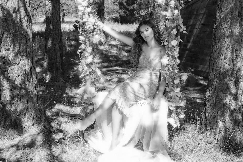
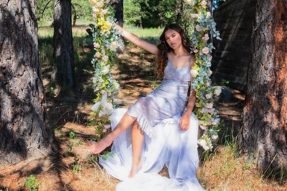
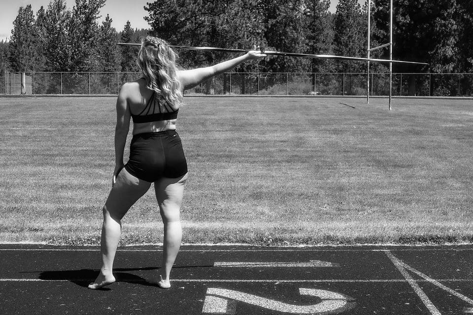
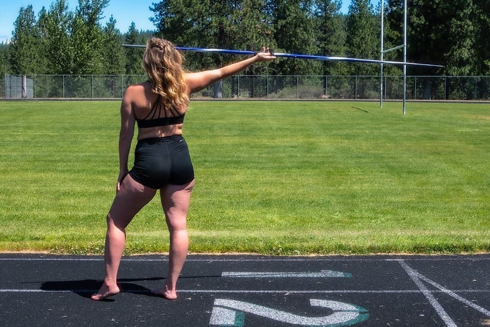
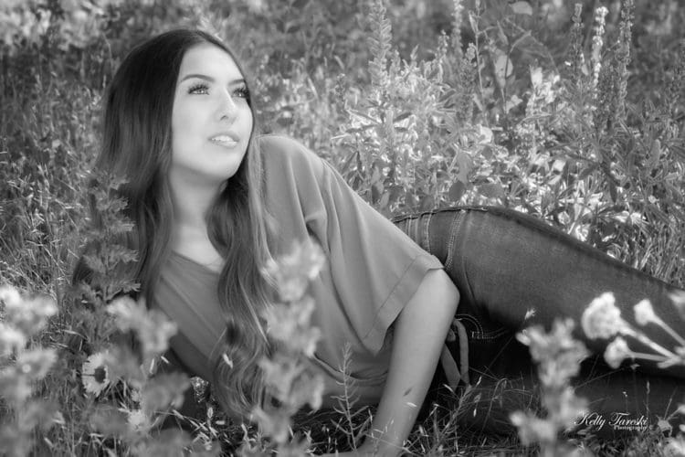
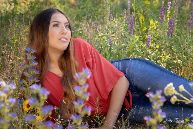
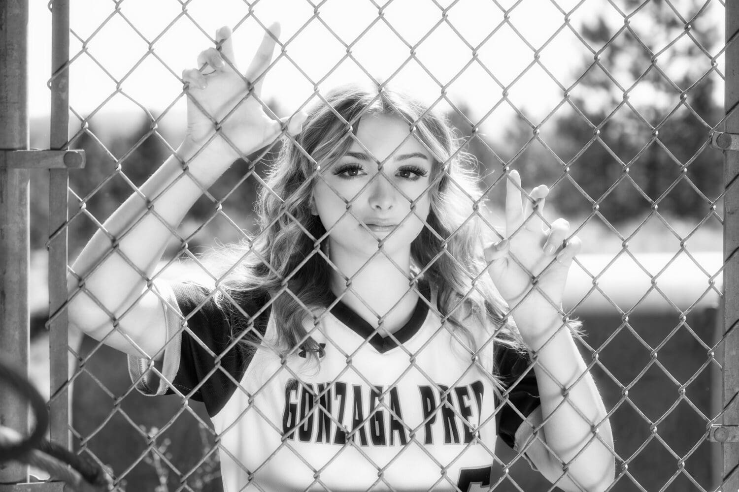
Black and white removes hue and saturation, so the viewer reads the image through brightness, contrast, shape, texture, and tonal separation. Color adds hue relationships and can carry important information about clothing, skin, environment, season, products, or design. Many portrait sessions benefit from a mix of both.
Black and White Photography
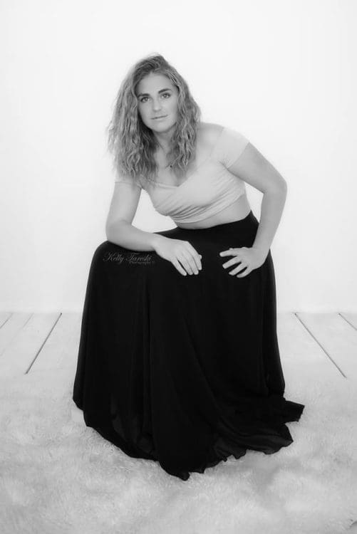
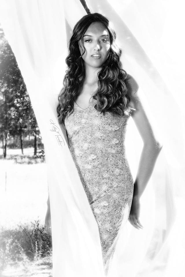
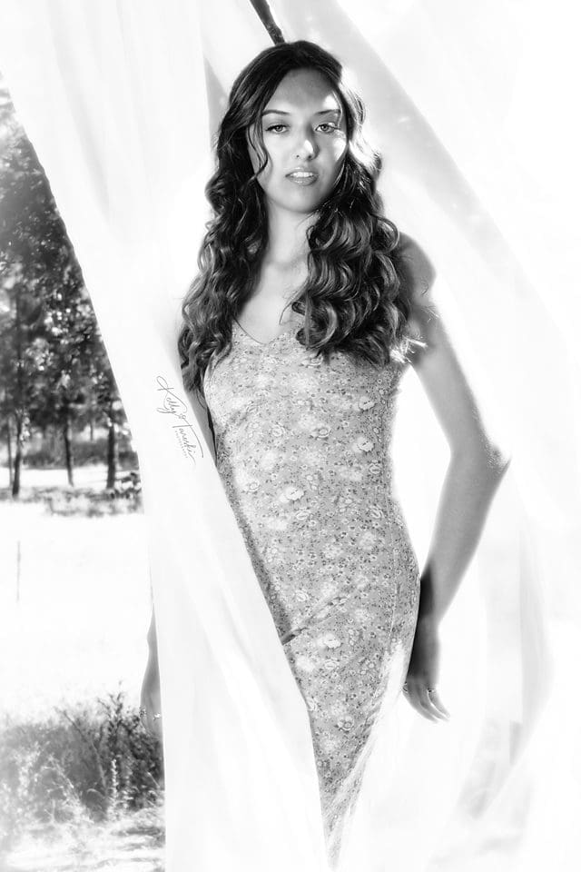
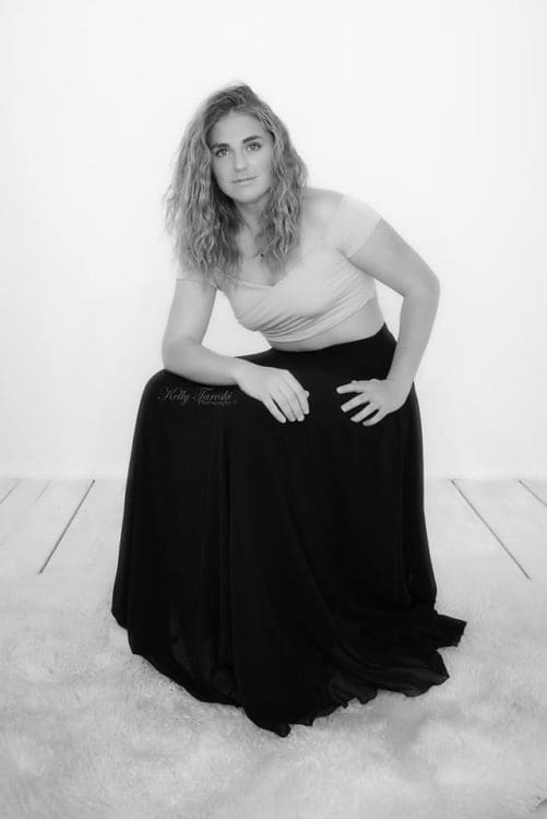
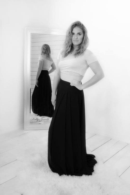
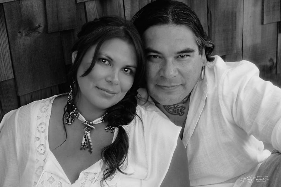
Black and white can simplify a scene when color is distracting or when the strongest information is in expression, light, shape, gesture, or texture. It can also make a busy palette easier to read. That does not automatically make the photograph more emotional or timeless; those qualities come from the image itself and from how the viewer responds to it.
For the definition, capture process, and editing principles, see What Is Black and White Photography?
When Black and White Works Well
- Tonal separation: The subject and background separate clearly through brightness and contrast.
- Shape and texture: Lines, form, skin texture, fabric, architecture, or directional light are important to the composition.
- Distracting color: Competing colors pull attention away from the subject.
- Series consistency: Monochrome helps a set of images feel visually unified.
When Color May Be Important
If color carries information or meaning, removing it can weaken the photograph. Clothing coordination, autumn foliage, brand colors, flowers, sunsets, product details, cultural elements, and environmental context may all depend on color.
Color Photography
Color can be part of the subject rather than just decoration. Hue, saturation, contrast between colors, and the color of the light can help organize a composition or provide context. Color photographs are not automatically more realistic because cameras, white balance, lighting, display devices, and editing all influence how color is rendered.
When Color Works Well
- Color relationships matter: Wardrobe, background, branding, flowers, landscape, or decor contribute to the photograph.
- Environment matters: Seasonal or location details help tell the story.
- Subtle skin and light variation matters: Color temperature and complexion are part of the intended look.
- The palette supports the composition: Color helps direct attention rather than competing with the subject.
Potential Challenges With Color
Strong or conflicting colors can compete for attention, and heavy color grading can date an image if it follows a short-lived editing trend. Those are creative and processing choices, not reasons color photography itself is less timeless.
How Should You Choose Between Black and White and Color?
The best choice is the version that makes the photograph communicate more clearly. In portrait work, I can evaluate both when appropriate: color may preserve important wardrobe, skin, or environmental information, while black and white may strengthen shape, expression, or tonal relationships. There is no rule that one format is more professional or more meaningful than the other. Join me for a free, no-obligation consultation, and let's find the style that best tells your story!
Black and White VS Color Photography

















Education Most Searched Articles
- Kelly Tareski Photography Homepage
- How to Choose Background Colors to Complement Skin Tones
- Choosing the Best Lens for Stunning Senior Portraits
- 5 Tips Using the Nikon Z7ii Camera for Portrait Photography
- Exploring Spokane Through a Lens: Must-Visit Photo Locations
- How to Choose the Best Lenses for Senior Portraits
- When to Use a Neutral Background in Photography
- Top Posing Ideas for Solo Portraits: Looking Confident and Natural
- The Economy and Photography
- How the Economy Impacts Photography
- How to Weather Economic Slumps as a Photographer
- Finding Creative Ways to Promote Your Photography on a Budget
- Free and Low-Cost Resources for Photographers