

How to Choose the Perfect Color Palette for Family Photos
Choosing the right color palette for family photos can make the difference between ordinary snapshots and stunning portraits that you’ll treasure forever.
We at Kelly Tareski Photography know that coordinating colors isn’t just about looking good together. The right combinations create harmony, highlight your family’s natural beauty, and complement your chosen location perfectly.
Which Colors Work Best for Family Photos
Color theory forms the foundation of stunning family portraits, but most photographers overcomplicate it. The truth is simple: warm colors like burgundy, dusty rose, and cream consistently produce more emotionally engaging family photos than cool blues and purples. Having at least one photo on your website pages can help boost social media shares and pave the way for higher engagement rates.
The Psychology Behind Warm and Cool Color Choices
Warm tones create intimacy and connection in family portraits. Colors like rust orange, deep maroon, and golden yellow trigger feelings of comfort and togetherness. Cool tones such as navy blue and sage green work better as accent colors rather than dominant choices. Family photos with predominantly warm color palettes consistently receive higher viewer satisfaction ratings and are more likely to be printed and displayed in homes.
Color Relationships That Create Visual Impact
Complementary color combinations like olive green paired with burgundy create striking visual contrast without overwhelming your subjects. These opposite colors on the color wheel naturally balance each other and prevent any single family member from dominating the frame. Analogous schemes use neighboring colors (like coral, peach, and cream) to offer subtle sophistication. Monochromatic approaches use different shades of the same color family and work exceptionally well for larger families where coordination becomes challenging.
Strategic Color Selection for Maximum Effect
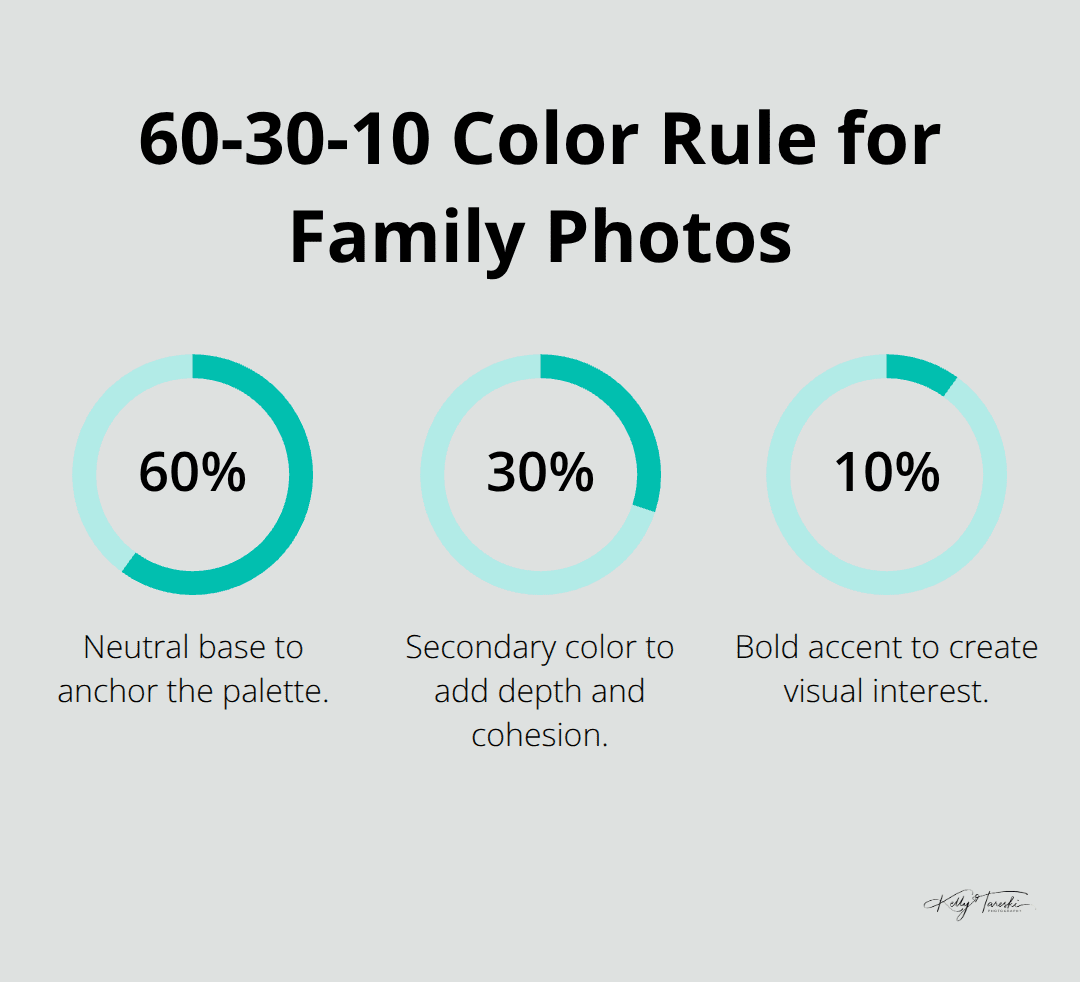
Choose one dominant color and support it with two complementary tones maximum. This approach prevents visual chaos while maintaining interest. Neutral colors like cream and taupe serve as excellent foundation pieces that allow bolder accent colors to shine. The 60-30-10 rule applies perfectly here: 60% neutral base, 30% secondary color, and 10% bold accent color creates professional-looking coordination.
Now that you understand which colors work best together, the next step involves considering the specific factors that will influence your final palette choice.
What External Factors Shape Your Color Choices
Your photo session environment dictates which colors will photograph beautifully and which will clash horribly. Spring sessions with blooming cherry blossoms demand soft pinks, creams, and light greens that harmonize with nature’s palette, while fall locations with golden leaves call for warm burgundy, rust, and deep orange tones. Beach sessions work best with navy blues, sandy beiges, and coral accents that complement the ocean backdrop.
Location and Season Impact Your Palette
Studio sessions offer complete color freedom, but outdoor locations require strategic planning based on seasonal foliage and lighting conditions. Summer sessions benefit from lighter shades that won’t absorb excessive heat, while winter shoots allow for richer, deeper tones that stand out against snow or bare trees. Urban environments with brick or concrete backgrounds pair well with neutral grays and warm earth tones.
Individual Features Drive Color Selection
Skin undertones determine which colors enhance your family’s natural glow versus those that wash everyone out completely. Warm undertones have a golden, peachy, or yellow hue and pair perfectly with coral, peach, and golden yellow shades, while cool undertones appear more pink, red, or blue and shine in dusty blue, lavender, and emerald green combinations. Hair color adds another layer of complexity: blonde family members look stunning in soft pastels and jewel tones, while brunettes photograph beautifully in rich burgundy and forest green palettes.
Hair Color Considerations
Redheads should avoid orange-based colors entirely and instead choose deep blues, emerald greens, or neutral cream tones that complement rather than compete with their natural coloring. Gray or silver hair looks elegant with jewel tones (sapphire blue, emerald green, or amethyst purple) that add vibrancy without overwhelming the subjects.
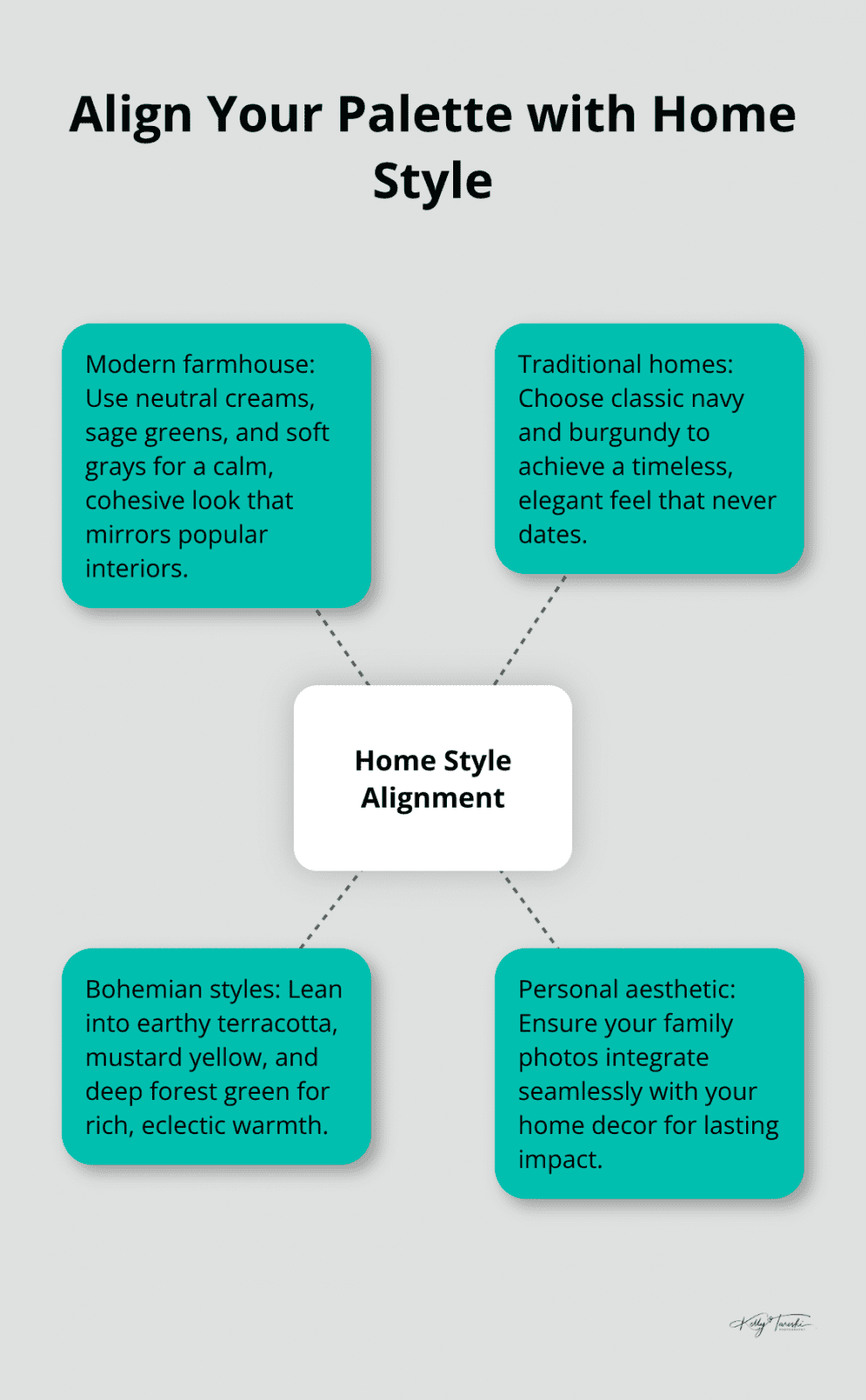
Home Style Alignment
Your family photos should reflect your personal aesthetic and integrate seamlessly with your home decor for maximum impact and longevity. Modern farmhouse styles call for neutral creams, sage greens, and soft grays that match popular interior trends. Traditional homes benefit from classic navy and burgundy combinations that never go out of style. Bohemian styles pair beautifully with earthy terracotta, mustard yellow, and deep forest green schemes.
These foundational considerations set the stage for exploring specific color combinations that photographers consistently recommend for different seasons and occasions.
Which Color Palettes Create Lasting Family Photos
Neutral earth tones dominate the most successful family portraits because they never compete with your subjects for attention. Cream, taupe, and soft beige create sophisticated foundations that photograph beautifully across all conditions and skin tones. These colors age gracefully in prints and complement any home decor style, which makes them the safest investment for families who want photos that remain relevant for decades. Understanding social media behaviors across different platforms can help you choose colors that resonate with your audience.
Earth Tones That Photographers Recommend Most
Sage green paired with cream produces consistently stunning results for outdoor sessions, while dusty rose combined with taupe works exceptionally well for studio portraits. These combinations photograph beautifully in both color and black-and-white formats (which gives you versatile options for wall displays). Mauve and olive green create sophisticated palettes that complement most skin undertones without washing anyone out.
Seasonal Palettes That Never Fail
Spring sessions demand soft pastels like dusty pink, lavender, and pale yellow that harmonize with blooming environments. These lighter shades reflect natural light beautifully and create airy, romantic portraits that families treasure. Summer calls for slightly deeper pastels – coral, mint green, and butter yellow – that won’t appear washed out in bright sunlight.
Fall and winter sessions shine with rich jewel tones like emerald green, sapphire blue, and deep burgundy that create striking contrast against seasonal backdrops. Jewel tones photograph with incredible depth and richness (which produces gallery-worthy portraits that command attention on any wall).
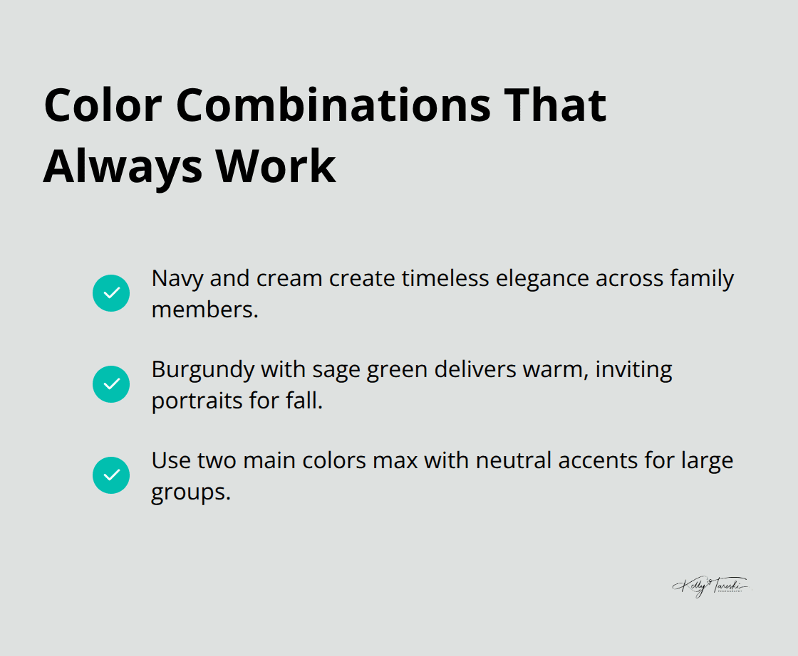
Color Combinations That Always Work
Navy and cream remains a popular palette choice because it flatters every family member while creating timeless elegance. Burgundy with sage green produces warm, inviting portraits perfect for fall sessions. For larger families, stick to two main colors maximum with neutral accents to prevent visual chaos and maintain focus on your family’s expressions rather than competing outfit elements.
Final Thoughts
Perfect color palette family photos balance multiple factors while you keep your family’s unique personality at the center. Start with one standout piece and build around it. Limit your selection to three colors maximum to prevent visual chaos.
Consider your session location, seasonal conditions, and each family member’s skin undertones when you make final decisions. Professional photographers bring invaluable expertise to color coordination challenges. We at Kelly Tareski Photography guide families through wardrobe consultations that eliminate guesswork and stress from outfit plans.
The most successful family photos use neutral foundations with strategic color accents that complement rather than compete. Avoid trendy colors that will date your portraits and instead choose classic combinations like navy with cream or sage green with dusty rose (these timeless palettes age gracefully and integrate seamlessly with any home decor style). These choices make your investment in professional family photography worthwhile for decades to come.
Suggested Reading
Education Most Searched Articles
- Kelly Tareski Photography Homepage
- How to Choose Background Colors to Complement Skin Tones
- Choosing the Best Lens for Stunning Senior Portraits
- 5 Tips Using the Nikon Z7ii Camera for Portrait Photography
- Exploring Spokane Through a Lens: Must-Visit Photo Locations
- How to Choose the Best Lenses for Senior Portraits
- When to Use a Neutral Background in Photography
- Top Posing Ideas for Solo Portraits: Looking Confident and Natural
- The Economy and Photography
- How the Economy Impacts Photography
- How to Weather Economic Slumps as a Photographer
- Finding Creative Ways to Promote Your Photography on a Budget
- Free and Low-Cost Resources for Photographers