
Branding Photography Tips: Elevate Your Business With Visual Consistency
Key Takeaways
Your brand’s visual identity is the first thing customers notice. When your photography, colors, and style stay consistent across every touchpoint, you build instant recognition and trust.
At Kelly Tareski Photography, we’ve seen firsthand how branding photography tips transform businesses. The companies that nail visual consistency don’t just stand out-they convert more customers and build lasting loyalty.
Why Visual Consistency Actually Moves the Needle
Inconsistency Damages Your Bottom Line
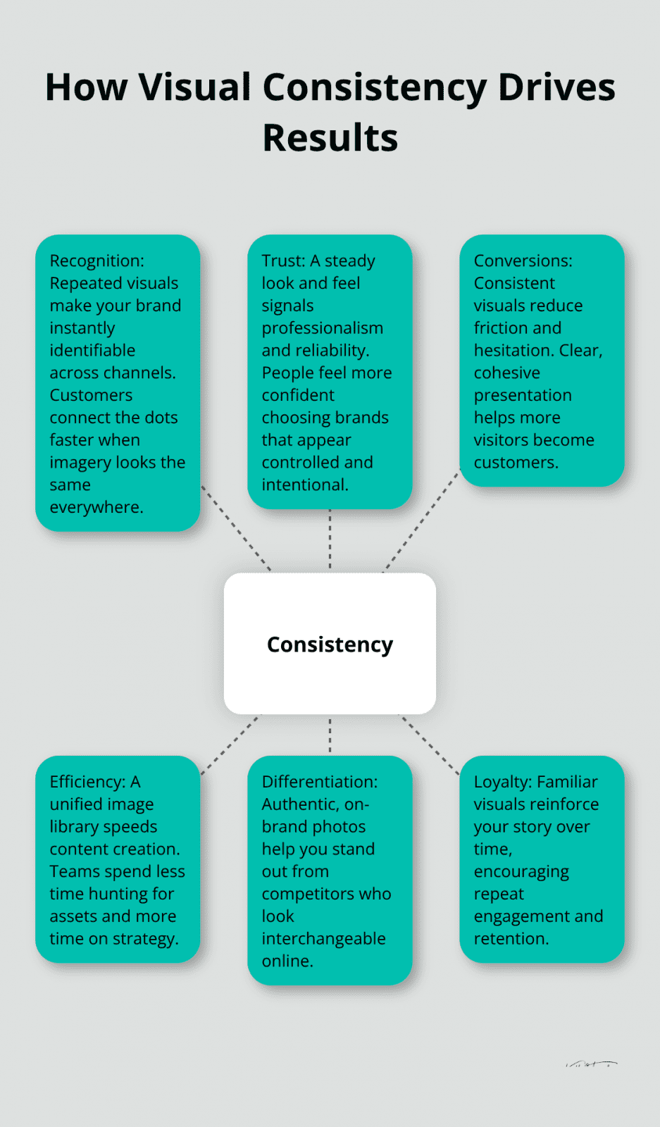
Inconsistent branding kills conversions. When your photography, colors, and messaging shift across your website, social media, and marketing materials, customers question whether you’re serious about your business. They notice the disconnect faster than you’d expect. The Nike swoosh works because it appears the same way everywhere-on shoes, billboards, social media, and packaging. That repetition creates instant recognition.
Without it, even great individual photos fail to build a cohesive brand identity.
Visual consistency isn’t a nice-to-have feature; it’s a business requirement. Companies that maintain consistent brand imagery across all channels see measurable improvements in how customers perceive them. A Harvard Business Review study found that businesses with consistent brand presentation are 3 to 4 times more likely to experience visibility. When your photography follows the same color palette, lighting style, and composition approach everywhere, audiences develop trust faster. They stop wondering if they’re dealing with the same company and start believing you deliver on your promises. Inconsistency signals unprofessionalism and lack of planning. Consistency signals control, intention, and reliability.
Custom Photography Beats Stock Images Every Time
The real competitive advantage comes from standing out through authentic, customized photography rather than relying on generic stock images that dozens of competitors use too. When you invest in professional brand photography, you create images that tell your unique story. Original photos perform significantly better than stock images on social media because they showcase the real personality of the brand. Your ideal customers recognize that visual language instantly, even before they read your logo or business name.
This visual recognition matters more now than ever. On Instagram, TikTok, and Pinterest, first impressions form in seconds. A cohesive visual library across your website, email campaigns, social posts, and advertisements reinforces your brand story repeatedly. Each consistent image acts as a silent salesperson, reminding customers why they should choose you over competitors who look interchangeable online.
Build Efficiency Into Your Content Machine
The long-term benefit extends beyond customer acquisition too. When your team has access to a well-organized collection of on-brand photos, content creation becomes faster and cheaper. You stop scrambling to find usable images and start pulling from a library that already aligns with your brand guidelines. That efficiency compounds over months and years, freeing your team to focus on strategy rather than asset hunting.
This foundation of consistent, professional imagery sets the stage for the next critical step: actually building that visual style in the first place.
Building Your Visual Foundation
Turning visual consistency from theory into reality requires three concrete decisions upfront. First, lock in a color palette and typography system that appears everywhere your brand shows up. Second, establish the emotional tone your photography conveys through lighting, composition, and subject matter. Third, decide on the physical and stylistic elements that will repeat across your imagery. These three decisions form the backbone of every photo you’ll commission going forward.
Choose Your Color Palette and Typography
Start with color. Your palette should contain three to five core colors that dominate your brand photography, plus two to three accent colors for variety. This isn’t about picking colors you like; it’s about selecting colors that reinforce what your business does and how customers should feel about it. If you work in wellness or luxury services, cooler tones and earth tones signal calm and sophistication. If you’re in tech or energy-focused industries, bolder, warmer colors convey innovation and movement.
Once you’ve selected your palette, apply it consistently through clothing choices, background selection, and even the props and styling elements that appear in your photos. Choose one primary font family and one secondary font family, then use them in every graphic, social post, and marketing material that accompanies your photography. This repetition trains your audience’s eye to recognize your brand instantly.
Establish Repeating Locations, Props, and Styling
The locations, props, and styling elements you choose should remain consistent across shoots. If your brand photography features a modern office setting with minimalist white walls and wooden desks, shoot there repeatedly rather than rotating through five different locations. If your photos include specific props like branded notebooks, coffee cups, or plants, those same items should appear across multiple shoots.
This consistency doesn’t feel boring to your audience; it feels intentional and professional. It tells customers that you’ve thought through every detail of how you present yourself. The repetition builds recognition faster than variety ever could.
Define Your Visual Mood and Tone
Most importantly, establish a mood and tone in brand photography that matches your brand promise. Are your images bright and energetic with natural window light and movement, or are they moody and intimate with studio lighting and stillness? Are subjects posed and formal, or candid and relaxed? These tonal choices should align with how you want customers to experience working with you.
The mood you select becomes the invisible thread connecting all your imagery. It communicates your values before customers read a single word about your business.
Document Everything in a Style Guide
Once you’ve made these three foundational decisions, document them in a style guide that your photographer can reference before and during your shoot. Include color hex codes, examples of preferred locations and styling, mood board images, and specific guidance on lighting approach and composition style. This document becomes the conversation starter between you and your photographer, eliminating guesswork and ensuring the images you receive actually build toward visual consistency.

With your visual foundation locked in place, the next step involves translating these guidelines into action through a practical audit of what you already have and a clear brief for what you need to create.
Moving From Strategy to Action
The gap between having a solid visual brand strategy and actually executing it trips up most small businesses. You’ve locked in your color palette, typography, and mood. Now you need to audit what already exists, communicate your vision clearly to a photographer, and create a reference document your team can follow without constant second-guessing.

Audit Your Current Visual Assets
Start with cataloging every photo currently on your website, social media, email campaigns, and marketing materials. Open a spreadsheet and note which images align with your new brand guidelines and which ones clash. Look for patterns in what works and what doesn’t. Are your current photos too bright or too dark compared to your intended mood? Do they use conflicting color palettes or inconsistent styling?
This audit takes two to four hours for most small businesses, but it reveals exactly which gaps your new photography needs to fill. You’ll discover you don’t need 200 new images; you need 20 to 30 strategically chosen photos that replace the weakest performers and fill the biggest visual holes. This focused approach saves money and accelerates the time before your brand looks intentional across all channels.
Brief Your Photographer With Specifics
Once you know what you’re missing, brief your photographer with specifics rather than vague requests. Instead of saying you want bright, modern imagery, show three to five reference photos that capture the exact lighting quality, composition style, and emotional tone you’re after. Specify which locations matter most for your business story-your actual office, a meaningful outdoor setting, or a client workspace.
List the exact people and props that should appear in photos, including branded items, team members by name, and any products or services you want featured. Share your style guide document before the shoot so the photographer understands your color palette, preferred clothing choices, and any styling constraints.
Collaborate With Your Photographer
A professional photographer will ask clarifying questions that help you think through details you might have missed, like whether you need both horizontal and vertical image orientations for different platforms, or how many shots you actually need. This conversation prevents the frustration of receiving beautiful photos that don’t quite match your vision. Collaborate with your photographer as a strategic partner, not just a vendor taking pictures. This collaboration ensures your investment in professional photography translates directly into images that strengthen your brand across every channel.
Final Thoughts
Visual consistency transforms how customers perceive your business. When your photography, colors, and tone align across your website, social media, email, and marketing materials, recognition happens faster and trust builds stronger. The companies that execute this strategy don’t just look more professional-they convert more customers and retain them longer. Inconsistency signals carelessness; consistency signals control and reliability.
The implementation path is straightforward. Audit what you currently have, identify the gaps, and brief your photographer with specific reference images and styling details. Document your color palette, typography, mood, and repeating elements in a style guide that guides every decision moving forward. This foundation eliminates guesswork and ensures every new photo strengthens your brand rather than working against it.
A well-organized library of on-brand photography becomes your content engine for months or years (your team stops hunting for usable images and starts pulling from assets that already align with your guidelines). Professional branding photography tips matter because they transform abstract brand strategy into concrete visual assets that work. At Kelly Tareski Photography in Spokane, we help businesses tell their stories through photography that resonates, and we’re ready to partner with you on your visual consistency journey.
Education Most Searched Articles
- Kelly Tareski Photography Homepage
- How to Choose Background Colors to Complement Skin Tones
- Choosing the Best Lens for Stunning Senior Portraits
- 5 Tips Using the Nikon Z7ii Camera for Portrait Photography
- Exploring Spokane Through a Lens: Must-Visit Photo Locations
- How to Choose the Best Lenses for Senior Portraits
- When to Use a Neutral Background in Photography
- Top Posing Ideas for Solo Portraits: Looking Confident and Natural
- The Economy and Photography
- How the Economy Impacts Photography
- How to Weather Economic Slumps as a Photographer
- Finding Creative Ways to Promote Your Photography on a Budget
- Free and Low-Cost Resources for Photographers